ET AL
Taste deserves infrastructure
From the reject pile
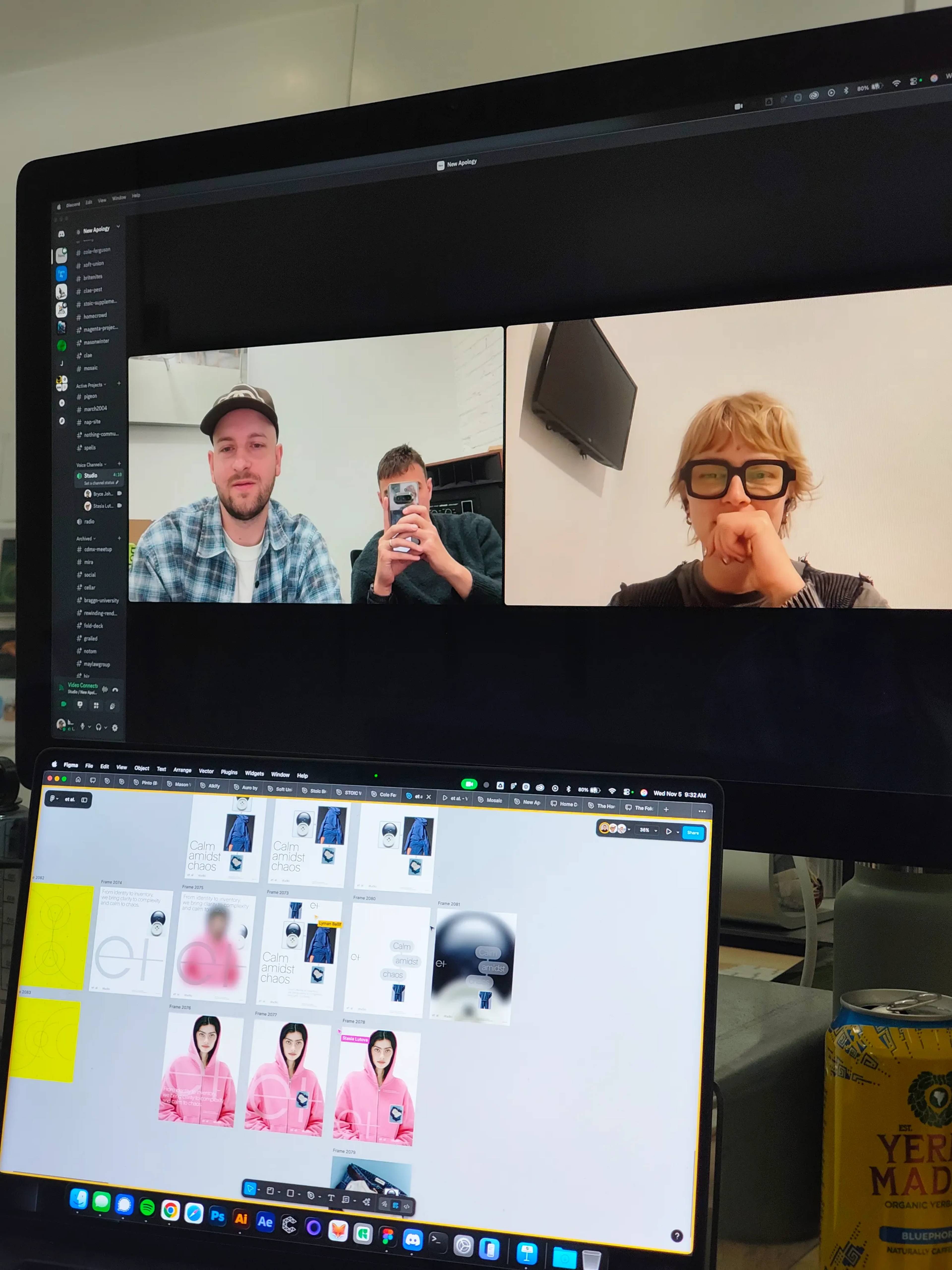
The ET AL mark started in a pile of rejected ideas in Stasia's corner of the Figma file. She had drawn a lowercase "e" and "t" early in the project, doubted it would hold up, and moved on. Lyman saw it there and thought it was simple, familiar, and a little risky, so we pulled it back in and kept working on it.
We had known Carson, the founder of ET AL, for years before he asked us to work on his brand. He had worked with a few of our friends on earlier versions of a sourcing company. He also developed a streetwear line with the Utah Jazz that debuted during NBA All-Star Weekend, where Lyman was consulting.
The brief
Carson wanted to turn the service he offered clients into a product. ET AL would take on sourcing, sampling, production, and delivery for young clothing brands and small teams, then handle inventory and reorders after launch.
His plans went well past that. He described a five-part platform that included a campaign studio, a venture arm, and a software business. Presented all at once, it would overwhelm a customer, so much of our early strategy work was deciding what the brand would leave out at first.
The name for the category came later. ET AL first called itself a "brand engine," which fell flat with the people Carson was talking to. "Pre-commerce" needed no explanation. Plenty of tools exist for selling a product, and ET AL covers the part before that, when the product is still an idea and a few bad samples.
Three directions
We presented three directions. One was a chunky, extra-wide wordmark paired with ultra-thin elements and a separate symbol. The "et" mark was the one we were most excited about and least expected Carson to choose.
He chose it by text.
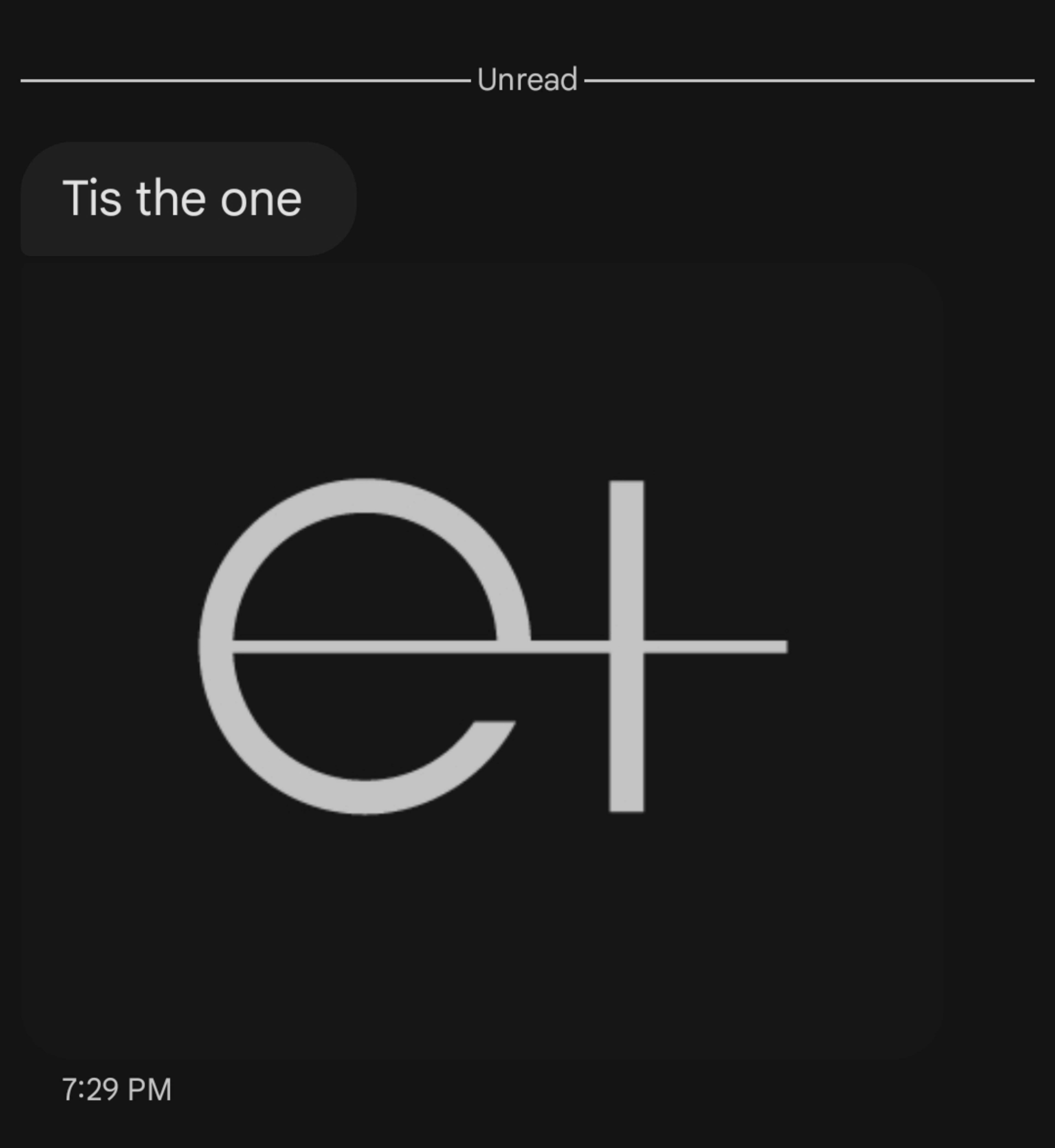
We kept it and folded in a few elements from a second direction. The safest option was the first to go.
Drawing the mark
The mark is a lowercase "et" in which the "t" is also a plus sign. The name is Latin for "and others," and the plus sign puts that meaning into the symbol.
We developed a geometric version from Stasia's drawing. The two crossbars, on the "e" and on the "t," are drawn at different thicknesses, and the mark depends on that contrast. We landed on a weight that felt sturdy and that reminded us of marks from the '90s and early 2000s, though we did not want nostalgia to be the point.
Our friend J. Hunor Vari, a Hungarian type designer, mastered it. He takes our ideas, tunes them, and pushes them further. The contrast between the crossbars would not survive at small sizes, so he built a variable version. As the mark scales down, the contrast drops and the strokes even out. Embroidered on a garment at its smallest size, it resolves into a single width.
Building the system through details
We proposed yellow as the brand color. Carson resisted, and we had to push for it. It is on the Supply site today.
The typeface is Rand, from the Swiss foundry Optimo. It reads as a neutral grotesque until you look at a letter like the lowercase "t," which tapers and meets the baseline sharply instead of curving past it. In the lighter weights you almost miss it.
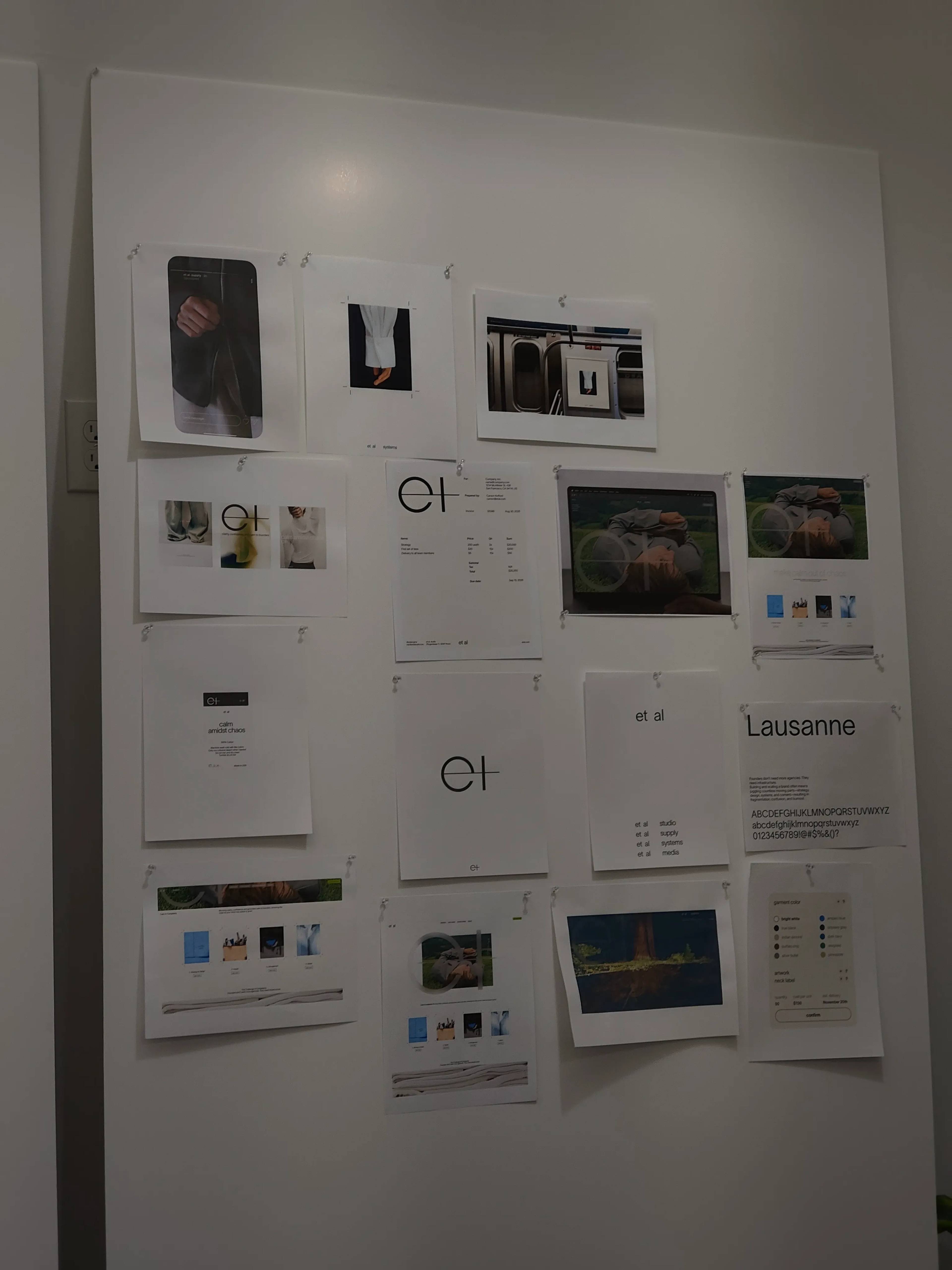
For the art direction, we kept sending each other architecture from the late '90s and early 2000s. An Are.na channel called Gen-X Soft Club was especially useful. It had a thread of office spaces by Yukio Hashimoto, Merkx + Girod, and MESH Architectures, full of semi-translucent materials. We reproduced that on screen with blur and variable opacity, so that what sits behind a button or a menu shows through without crowding it.
The websites
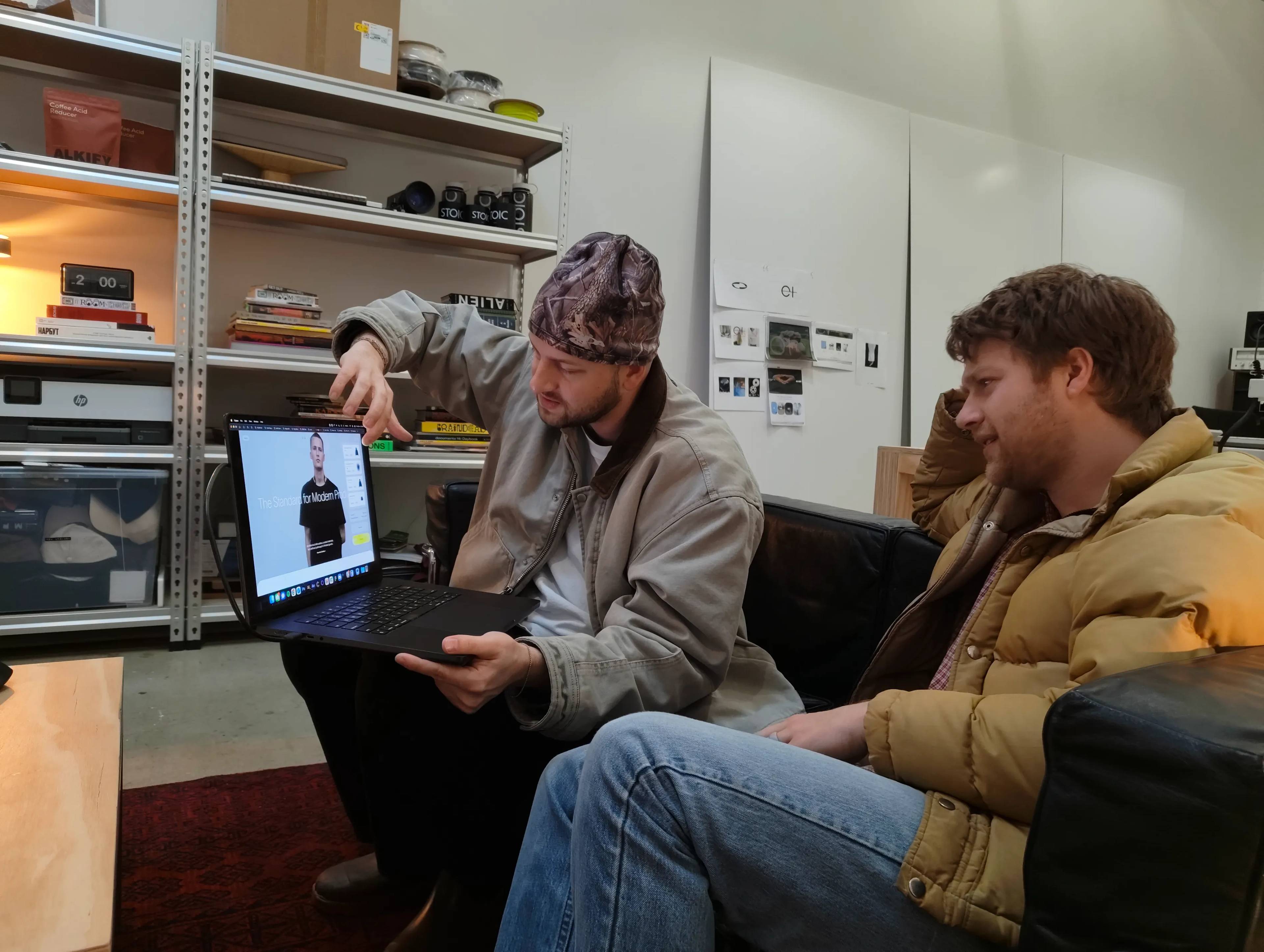
The website was the first project for Alvaro Canovas, a designer from Mallorca who joined us full-time once the identity was done. It began as a site for the whole ET AL ecosystem. Our friend Roko Gabrilo developed it, and we delivered it in late 2025.
That site is where we set the motion principles for the interface, including the soft-linking buttons: a text label and an icon joined by a liquid-like bridge, which separate or join when you hover.
At the same time, we were designing a second site for ET AL Supply, the production service itself. Carson interviewed several development studios and settled on Darkroom. They started building our first design for Supply. Fairly early on, that build was paused in favor of a new marketing site, which the ET AL team took on internally with a designer from Darkroom.
Having the scope change that many times before launch was disorienting. Carson needed to get more focused, and after talking with investors he settled on a final site centered on ET AL Supply, starting with t-shirts and hoodies. Darkroom Engineering, Davyd Shamiiev, and Anton Sementsov developed it. That is the site live today.
Kyiv
In the spring of 2026 we went to Kyiv for a four-day shoot. The budget was too small to shoot at the scale ET AL needed in the United States. A comparable production in Los Angeles would have cost five to seven times more.
We shipped packages of clothing from different suppliers to Poland, then brought them into Ukraine. Christian, a partner at New Apology, produced the shoot, and he and Lyman came in from Poland on an 18-hour train. Stasia, who lives in Lviv, took an eight-hour train to join them.
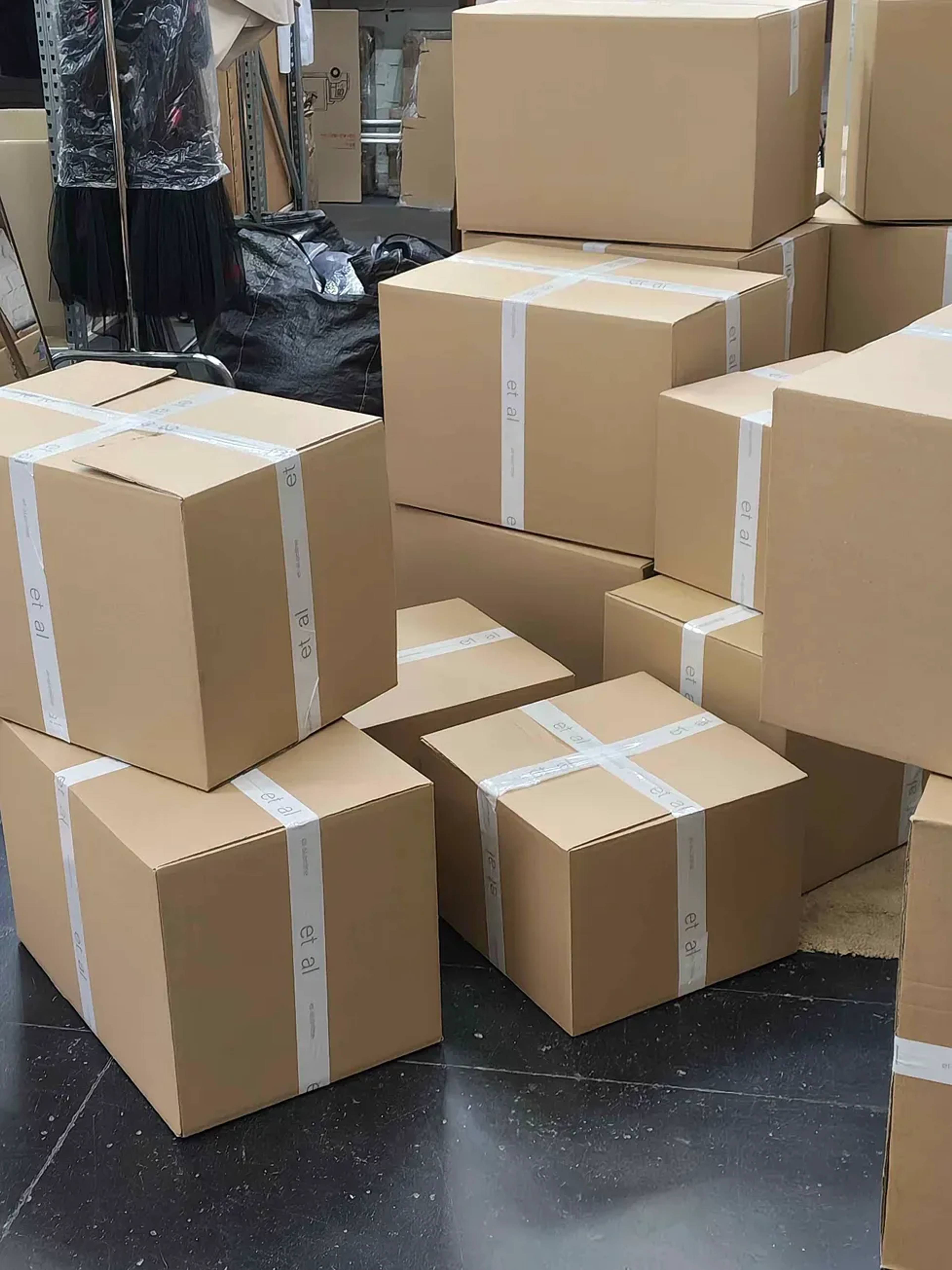
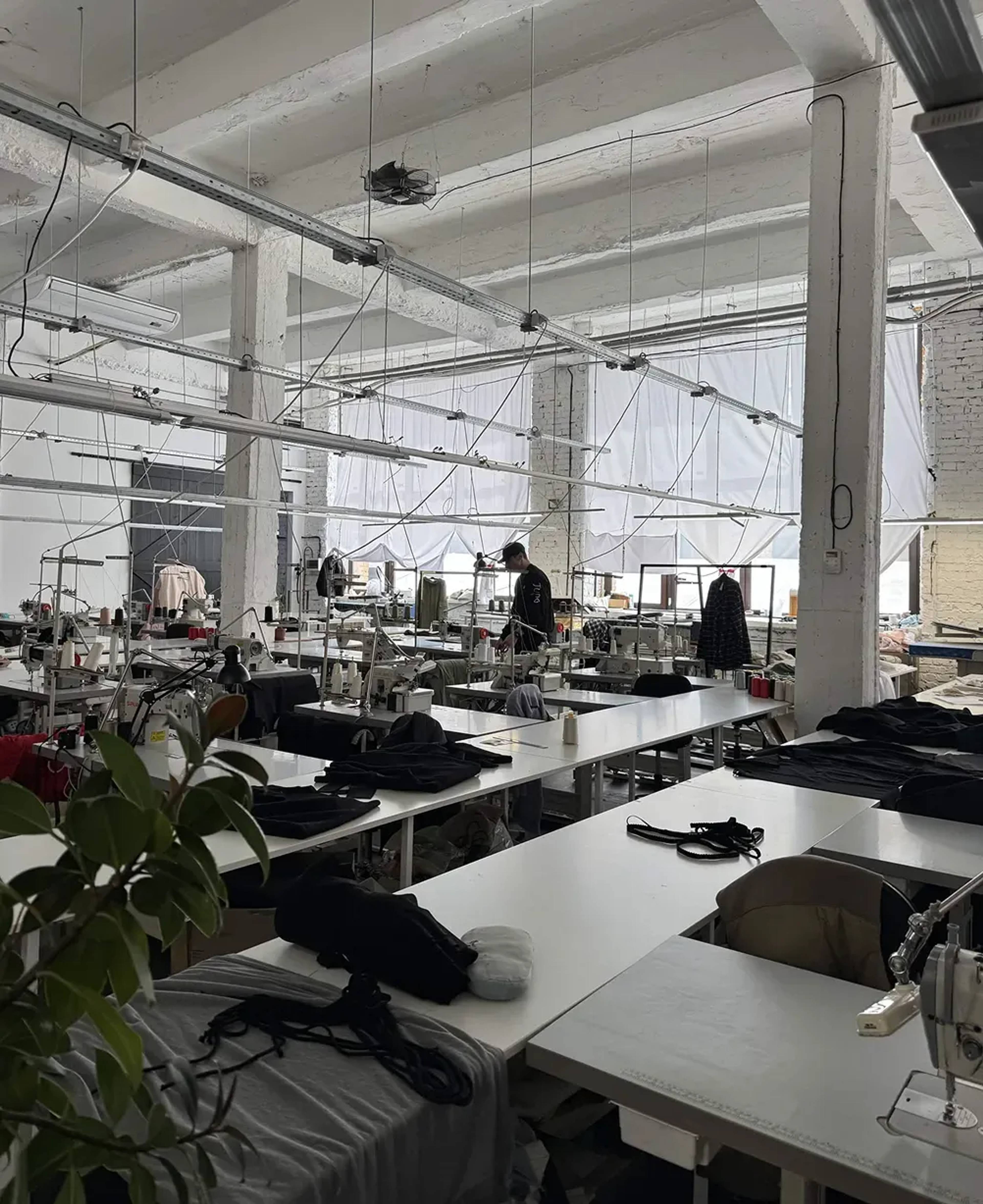
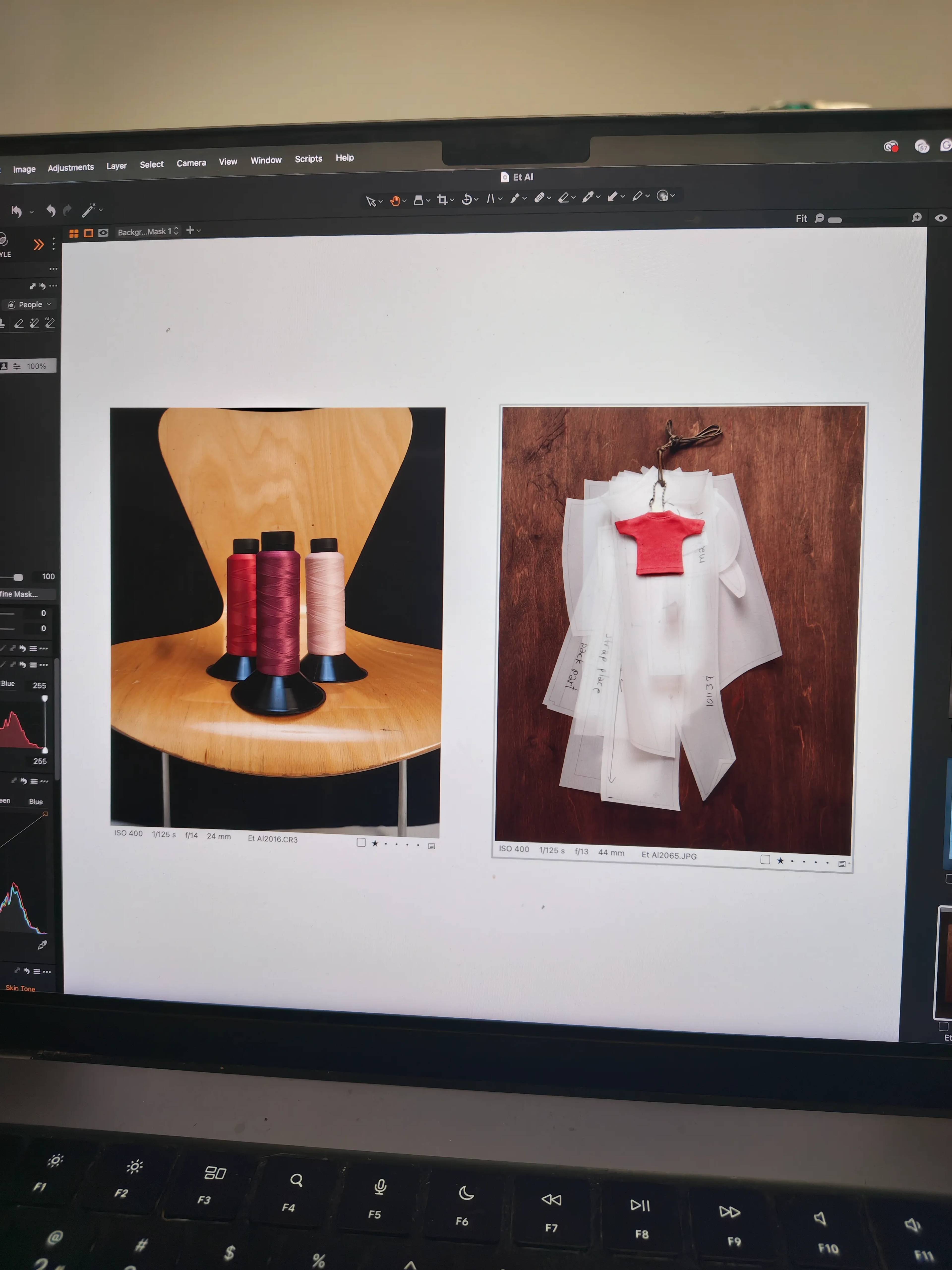
We shot at three locations, including a clothing factory and Kult Studio, where we spent two days filming and photographing. Sync Age handled production, and Andrew Gray, Valeria Levanova, and Denis Manukha photographed most of ET AL's garments.

The shoot stopped for air raids. When the alerts came, we went underground and waited.
On the night before Lyman left for the States, a bombing destroyed Kult Studio. No one was hurt. We found out on Instagram.
Configurator interface
Much later, we took on an involved and demanding piece of interface design: the configurator. It is a web app inside the website, where customers pick a garment, write their own text, and add their own graphics. The idea was to bring print-on-demand up to a luxury level while keeping it accessible. A client might use it a thousand times, so we held each surface to one or two gestures.
We designed it in-house alongside our friend Kirill Kozyrev, who brought finesse and careful thought to the whole process.
Where it stands
As Carson launched ET AL, he needed to make the process visible to people. We explored dozens, if not hundreds, of marketing templates that could carry a wide range of assets, and ET AL uses them now.
The scope changed again and again, and the identity held up through all of it. A drawing Stasia had set aside in the Figma file is the mark ET AL launched with. We are proud of the work that helped get it started.